Change the Bootstrap NavBar Breakpoint
I use mostly Bootstrap framework for my every projects. Although I like the Foundation framework. If the provided design does not seem proper for any of these framework I used to hard code the rest of the work. I often face a situation like designer wants a different breakpoint to trigger the mobile menu. Suppose a designer wants the mobile menu from the “md” size. This is quite easy in bootstrap. There are two ways of doing this. One is to modify the less source file and recompile it. The second one is directly write CSS codes.
###Modifying the LESS file
Change the @navbarCollapseWidth variable in less/variables.less file to your desired value. Then recompile the less file to produce the updated CSS file.
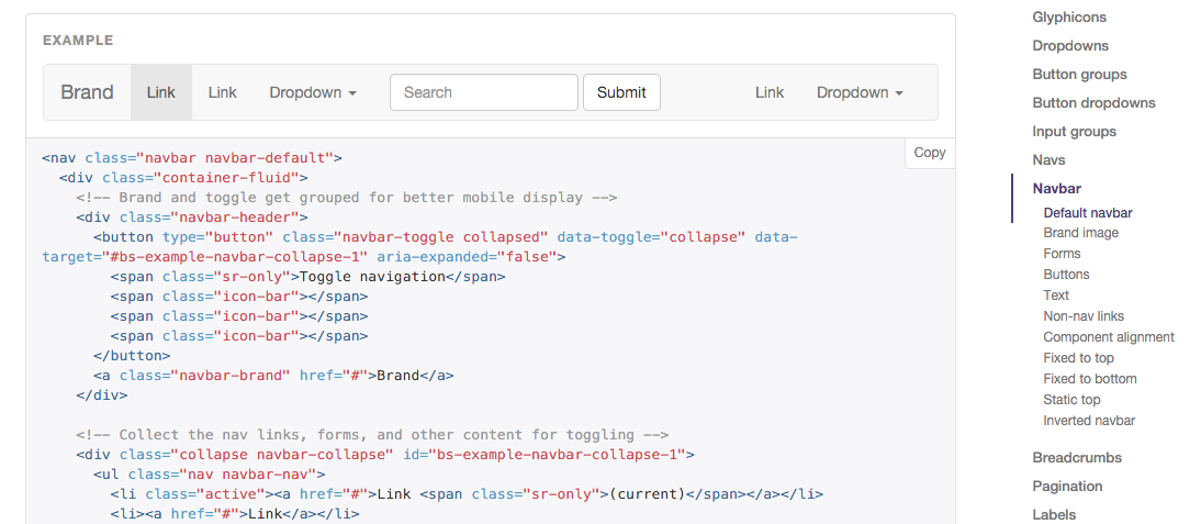
###Modifying the CSS file This is quite easy and I thing most of the people will use this method. Just Place this section in your stylesheet to overwrite the default behaviour.
/* showing the mobile menu */
@media (max-width: 1070px) {
    .navbar-header {
        float: none;
    }
    .navbar-toggle {
        display: block;
    }
    .navbar-collapse {
        border-top: 1px solid transparent;
        box-shadow: inset 0 1px 0 rgba(255,255,255,0.1);
    }
    .navbar-collapse.collapse {
        display: none!important;
    }
    .navbar-nav {
        float: none!important;
        margin: 7.5px -15px;
    }
    .navbar-nav>li {
        float: none;
    }
    .navbar-nav>li>a {
        padding-top: 10px;
        padding-bottom: 10px;
    }
}
Note: Replace 1070px to your desired value.
That’s it, that’s how to change the default Bootstrap NavBar breakpoint.